Pep Coaching Bot
date published : June 01, 2017So 2016 was officially the year of the bot, or more accurately the conversational user interface. An opportunity arose for me to do a bit of development work on the side, at around the same time I was finding it difficult to carve out the time in my day job to get hands on and write code, so the chance to bring in a little extra money and roll my sleeves up was a no brainer.
The proposition was to put together a creativity and productivity coaching application, delivered via a personal assistant, (called Pep) to engage the user, offer advice, tips and coaching and help the users to set and achieve goals.
Prior to the build both the client and myself had conducted market research into the apps available, it seems like everyone wants to get more done with less time, so there is a glut of goal setting and productivity applications out there, however, my client’s idea or USP was to deliver coaching and mentoring to help achieve goals via a ‘bot’, hence the idea for Pep.
The Technical Stack
Before I set off on what will no doubt be an epic description of the project it’s probably best to quickly describe the technical stack, parts of this will be referenced below but for clarity the application consisted of the following;
Pep
- Node, Express server application
- Jade template engine, now known as Pug
- Passport user authentication
- Backbone SPA
- MongoDB document store
- Mongoose, a MongoDB object modelling tool designed to work in an asynchronous - environment.
- Slack integration
- Email integration via SendGrid
- Hosting via Heroku
Importer
- Node CLI application
- MongoDB document store, again accessed via Mongoose
Initial Concept
This initial concept was backed up by a clickable invision prototype which helped to show the basic interactions and user interface idea, the application was called Echo at this time (the much better name Pep came about later) and the designs did a very good job of presenting the idea.
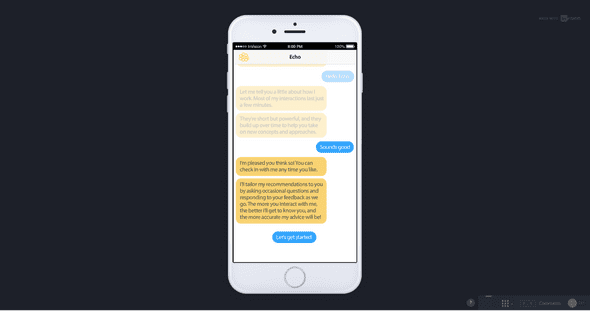 A screenshot from the initial mock up, showing the core concept and also hiding significant complexity!
As with all ideas and UI prototypes or mock-ups there is a significant amount of functionality, behaviour and logic implied and it is usually the job of the implementors to unearth this, clarify it, question it, poke it with a stick, document it and then get down to building it.
This identifying and agreeing of functionality was to be an iterative process throughout the whole project and helped to deliver a polished application and user experience from a very complex set of requirements and rules.
Architecture
So first and foremost some consideration of the application architecture was needed, although this was only a prototype application it made sense to at least plan what a production system would look like in terms of the major components, then we can look at what a scaled back prototype would need to allow us to bring an MVP to market quickly whilst aligning the system with a larger longer term architecture.
To this end I put together the following production architecture diagram, showing the major components of the system.
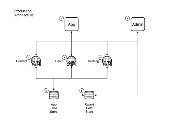 Major components of a possible production architecture
Production Architecture Components
- Native (and possibly web based) applications.
- Content API, in order to provide content for delivery to the users via the applications.
- Users API, for authorisation and authentication, user and profile management.
- Tracking API, to gather and manage information on application usage for monitoring and optimisation.
- App Data Store, data store for use by the applications, holding data in a form suitable for use by the application.
- Report Data Store, a second data store holding relevant data transformed from the app data store for reporting purposes.
- Admin Interface, web application to provide access to reports, configuration of the applications, management of content and other supporting operations.
As you can see the scope of this is significant, and moreover is not necessary for an initial prototype, so with that in mind a more realistic architecture for an MVP is shown below.
Simplified prototype application architecture
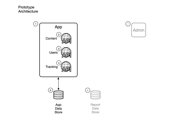 Prototype Architecture Components
- App, web based application (rather than native) that contains services providing functionality in the same three main areas as the planned production APIs.
- Content API, rather than a separate API this can be delivered by logic within the application initially and carved out later into a separate API.
- Users API, as with the above this can be delivered within the application and carved out later.
- Tracking API, as with the above this can be delivered within the application and carved out later.
- App Data Store, data store for use by the applications, holding data in a form suitable for use by the application.
- Report Data Store, out of scope for the prototype.
- Admin Interface, out of scope for the prototype.
Detailed Requirements
So now we have an idea of the overall shape of things, what is the application actually supposed to do? Time to gather some requirements, a high level list of these included;
- Mobile first web application, responsive layout so that it also looks good on desktop
- Dynamic interface, directed by the users choices to create branching dynamic conversations
- Week based format, with daily check ins, weekly goal setting, and goal and wellbeing catchups
- Intelligence to prevent repetition or duplication of content so that the conversation changes each time the user checks in
-
A wide variety of content types and the ability to link between these, including;
- Greetings
- Sign-offs
- Onboarding
- Goal setting
- Challenges
- Positive and negative responses
- Insights of various types
- Jokes, quotes and book recommendations
- Building up of a profile of user responses, goals and wellbeing information
- Usage of the user profile to serve relevant content, such as insights related to goals or content to support the user’s current level of wellbeing
- Gathering of statistics and information on usage of the application to allow analysis of performance of both the application as delivery platform and the content it delivers
- Administration pages for specific admin users to review user conversations and statistics
- Integration with Slack and Email
- Hosting, set up and monitoring of the application and it’s data store
As described earlier this list formed over the duration of the project, several requests and requirements were discussed and parked for later, and many made it onto the list for inclusion in the prototype.
Shaping the Content
First and foremost the application is nothing without content, so the initial challenge was to find some way of structuring and shaping the content to allow the kind of branching dynamic conversations envisioned by the client.
I started with a fairly simple Google Sheet that I formatted to help capture some initial content and show how we could start linking individual items together, over time this sheet went through numerous iterations, with columns being added, changed or dropped as the requirements formed. This led to further documentation to help describe and clarify the shape of the content as well as the format and functionality of the options as there were several key variations that we included in the scope of the prototype.
An example of the Content Sheet is shown in the screen grab below.
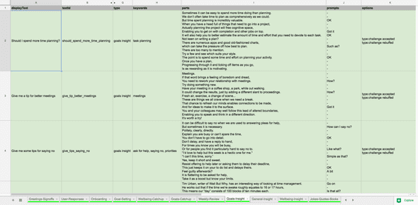 As you can see the basic structure of each item is set out in the Content Sheet, allowing for the production and import of content for the application to consume and present to users.
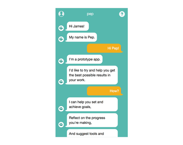
Each content item is described as a set of parts, and each part represents a single speech bubble in the user interface, in this way we can present each item as a series of sentences that makes the interface feel more like a conversation and brings Pep’s personality to life a little.
Alongside the parts there are also prompts, which are preset pieces of text that are displayed to the user mid-conversation and must be clicked/pressed before the conversation continues. This simple idea forces the user to participate in the interface further reinforcing the feeling of a conversation. Once a prompt is clicked the format of this changes to a speech bubble called out from the user’s side of the conversation.
Below is a screen grab showing a single content item, as you can see this has several parts and prompts to it and looks like the kind of interface you would normally associate with a messaging application.
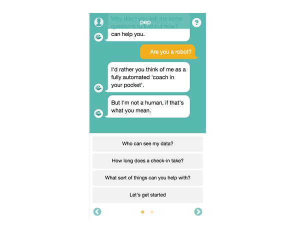
At the end of each content item the user is presented with one or more options (or in some cases automatically taken to the next item), the screen grab below shows a carousel of options that the user can select from, note the bullets indicating further options for the user are available.
As well as the parts, prompts and options each content item also consisted of several other fields, including display text, unique text identifier, type, category, keywords, profile capture and achievements. These other fields were used to pick content for display in reaction to user actions within the application, such as selecting an option, checking in, setting a goal, etc.
So Many Options
One of the most complex parts of the application logic was the ability to specify options to show to the users at the end of each content item, there were several variations of the type of option(s) available to users, as shown below.
This section covers the options in depth, feel free to skip, it is worth noting though that these variations are the core branching functionality that brings the conversation to life and consumed a significant amount of the development time.
I suggested a form for the options to be written in so that I could reliably import this data. The key part was reaching an agreement with the client who would be writing these options and building the branching conversation tree. Over the course of the build we settled on the following variations and formats as support for each type of option was added.
1. Set Option
Some text to display / the_text_id_of_the_item
e.g.
The work was enjoyable / work_was_enjoyable
As the example above demonstrates the basic set option consists of 2 parts, the display text to show in the options in the conversation UI and the text identifier of the content item to show if the user selects the option, separated by a forward slash.
2. Set Option With Return To
Some text to display / the_text_id_of_the_item / returnTo:the_text_id_to_return_to
e.g.
Confirmation bias? / defining_confirmation_bias / returnTo:yes_positive_about_week_2
This is an iteration on the set option above, it has an extra property separated by a forward slash which takes the form of the prefix returnTo then a colon and then the textId of the item to load automatically after the final part of the current item has been shown (plus a short predefined delay).
3. Random Option
type:the type
e.g.
type:goal insight
The random option is specified by the above format, prefix of ‘type’ then a colon and then the type to select a random option from. There are certain caveats when selecting a random option by type that the application takes into account, these include removing content items from the set of items to pick from if;
- they have already been displayed to the user in the current conversation
- they have already been selected as a random option for the current content item
- they are the current content item, to prevent an option causing a loop
4. Random Option With Keyword
type:the type, keyword:the keyword
e.g.
type:challenge, keyword:reflection
This works the same way as the random option, except the set of items to pick a random item from is limited by the type and the keyword in question.
5. Set Auto Option
auto:the_text_id_of_the_item
e.g.
auto:goals_intro
This option will only ever be present by itself. Pep will automatically load the item that is specified by the text identifier after the final part of the current content item is shown (plus a short pre-defined delay).
When a single auto option is required then this will be formatted as above, prefixed by “auto:” and followed by the text identifier of the item in question.
6. Random Auto Option
type:the type, auto:true
e.g.
type:challenge, auto:true
This is another variation of the random option, this time a randomly selected option of the type specified will be automatically loaded after the final part of the current content item is shown (plus a short pre-defined delay).
When we want the random option to be automatically loaded we must specify this with a suffix “, auto:true”, this differs from when we use auto for a set option, (see variation 5 above).
7. Random Auto Option With Keyword
type:the type, keyword:the keyword, auto:true
e.g.
type:challenge, keyword:reflection, auto:true
This is yet another variation of the random option, this time a randomly selected option of the type with the keyword specified will be automatically loaded after the final part of the current content item is shown (plus a short pre-defined delay).
As with option 6 we must specify the auto functionality with a suffix of “, auto:true”, this differs from when we use auto for a set option, (see variation 5 above).
8. Random Option With Set Display Text
Some text to display / type:the type
e.g.
Bye for now / type:signoff
This is a combination of the set option and the random option, in that the text to display is specified and a random option by type will be used. The format is as shown above, display text then a forward slash and then the type to select a random item from.
9. Predefined Selection
selection:the_selection_text_id
e.g.
selection:selection_1
This is a way of specifying a selection of different options to show after a content item based on a predefined set of options.
The set of options for each selection can contain any of the previously described types and will be specified in the application configuration, only two selections were specified in the end making this a simple matter to hold in configuration and apply as and when needed.
Example Selection
selection_1
type:goal insight
type:body brain insight
type:business insight
type:joke
type:quote
type:book
Bye for now / type:signoff
Needless to say as the library of content grew there was the occasional error or typo in the writing of the content. The import process had to be robust enough to handle this and was developed to reject items and warn of issues in the content. These were then communicated by me to the client for correction so the offending items could be re-imported asap.
Importing The Content
It quickly became apparent that I had to find a repeatable and robust way of populating the data store with the content, especially given the amount of content that would be produced.
To this end I developed an import process that read data from the Google sheet, processed this using logic that met the requirements, (in particular the processing of the various types of option) and imported the data to our data store of choice.
This was a small Node based CLI application that made use of the Q promise library to buffer promises of the async calls to Mongoose and when all were satisfied return control to the main program loop and report results on the documents created in the data store.
The importer first cleared all old content then imported, as a full refresh was easier to implement than an incremental process. The importer contained mostly simple formatting logic, although the processing of the predefined selections as well as other types of options was also held here.
This allowed the importer to deal with this complexity and let the actual ‘Pep’ application focus on using these now well formed options to deliver the presentation and branching logic.
The Data Store
As mentioned I used MongoDB as the data store, rather than provision my own store I opted to use a hosted service. mLab (previously mongoLab) offers a free sandbox tier which is more than adequate for development purposes.
When we launched the prototype application I made sure to upgrade to the lowest paid for tier (on shared infrastructure) so that we had guaranteed availability as well as a replica set for redundancy purposes, the costs for this are negligible.
As well as providing the data store as a service mLab also has a really handy admin interface for querying and working with your data which really helped to speed up development, I would not hesitate to recommend this service.
On that note MongoDB themselves now also have a free tier in their hosted service Atlas, so this is something I’ll be checking out for future projects as it could well rival mLabs offering.
Initial Working Prototype
Somewhere along the way I managed to get a basic working application up and running, as you can see from the screen grab below the look and feel was a bit rough and ready but was enough to demonstrate the basic mechanism of the conversational user interface.
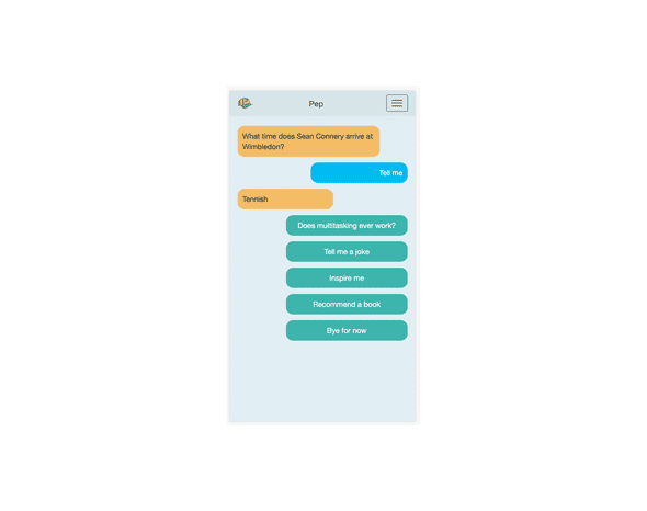 Pretty rough and ready initial prototype, but it did function and demonstrate the ‘conversation’
What was needed now was a touch of magic from someone with a better eye for design than myself!
Touch of Design Magic
A mutual friend of the client and myself (the person who kindly put us in contact with each other and started this crazy journey) just so happens to have a background in design and was asked to put some designs together for the look and feel of the application.
As you can see from the screen grab below these designs show a few variations and also further profile screens which didn’t make it into the finished prototype (but were planned for later development), As with all designs some flexibility is required at implementation time.
The most obvious one is the use of gradients as backgrounds, given the way that the conversation was technically implemented, with an ever expanding body (as further elements are added to the DOM as the conversation progresses), the gradient proved to be problematic as the height of the page which the gradient was set on was continually growing. For this reason we decided to opt for a plain non-gradient background.
Having come from a back-end development background my initial thoughts of the designs were somewhere between ‘cool!’ and ‘how on earth am I going to deliver that?’, taking these designs and implementing these on a working application was one of many areas which I had to up-skill during this project, one of the many benefits of taking on this side project.
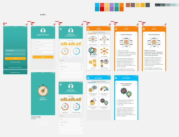 Polished designs, showing far more pages and functionality than the initial scope!
Debug Mode
As the application included some fairly complex logic around what content to show when, what options to present after each item and how these would interact with the content already seen and not yet seen, it became quite tricky to test.
Also as most of the development work was undertaken in the evenings or late at night when my brain was not at its most alert I came up with the idea to help myself (and the client, as he was the primary tester) by displaying additional meta data within the conversation, so we could track what types of content were being shown and what options were available.
This ‘debug mode’ as I called it also presented further options within the user profile page for administrative users (the client and I) to ‘reset’ or otherwise manually manipulate our user profiles in order to change the times and numbers of our check ins, or our goals or keywords and other meta data held against our profile that was used by the application logic.
This functionality added to the requirements and scope of the project but was invaluable when debugging logic and ensuring that the conversation flowed as expected.
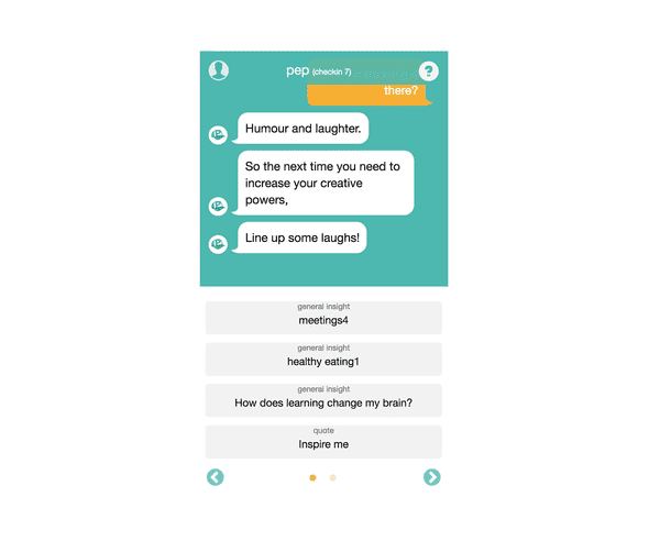 Example of the options showing their content item type in debug mode, proved very useful when testing the application logic
Check Ins
The experience was built around the concept of check-ins, so each time the user checked in with Pep they would be asked about their current goal (if they had set one, if not they would be prompted to set one) and their current wellbeing, the user could choose to engage with these questions or skip through these and consume content via the options presented to them.
This allowed a fairly simple overall structure to each check-in which could be followed or ignored depending on how the user felt. Initially this structure was significantly more complex, however this presented several challenges, not least of which was the development of the logic. Further to this though it became very difficult for the user to get a sense of the purpose of the check-ins and the application overall, so by simplifying the structure and the start of each interaction the application’s focus became much clearer and the logic was more easily implementable.
One interesting point that we found during development was that without any limit on the duration of each check-in a user could exhaust the entire content library in a single sitting, if they were so inclined. To mitigate this we decided to restrict the number of items each user could view within a single check-in, so after the initial greeting and catchups the user could only view a few items before Pep led them to a sign off. This allowed the user a bit of exploration through the content without allowing them to rinse the system of all its data in one go.
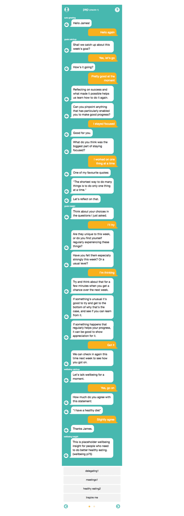
An example of a complete check-in can be seen in the following screen grab, as you can see this is quite long as it stands imagine how much longer it could get with no restrictions!
An example of a check-in where both goal and wellbeing catch ups were followed, again you can see the content item types displayed above each item in the conversation as part of the debug mode functionality.
User Testing
In order to see if we had built something of value, that we had a product (even in a rough early form) that people would pay money for we needed to test the application out. So both the client and myself put out an APB for help to friends, family, colleagues and peers.
We did surprisingly well and managed to enlist the help of around 30 people, with the majority being family and friends of ours.
Asking friends and family could have easily skewed the results, if people hadn’t been willing to be brutally honest, thankfully my friends don’t seem to worry about potentially hurting my feelings as they were frankly brutally honest! Despite my joking tone this was a great outcome, no doubt assisted by the engagement and instructions coming from the client and not myself.
This seemed to help distance the testers from myself to the extent that they felt they were testing something I was involved in but not solely responsible for, and as they had no previous relationship with the client (and I had asked them to be honest when I asked for their participation) they were very open and honest about the experiences with the application.
The client produced enough content for users to check in a couple of times per day for a week, so that the chances of the users exhausting content was mitigated, and we left them to their own devices with only basic instruction to register, check in daily and also add a record of each interaction via a Google Form that collated the results in a Google Sheet we could review.
Part of this sheet was a subjective ‘how useful did you find the application’ score, out of 10, which we asked for after every interaction. Over the course of 2 weeks (with 2 different cohorts of users) we averaged 6.3, not bad for our first prototype, although not good enough in terms of net promoter score.
The feedback was really useful for spotting (and hastily fixing) bugs that would detrimentally affect the testing, also and more importantly it helped to gather opinion on the value the users placed on the application and what features they liked, disliked or felt it lacked or needed.
Learning From the Experience
I know it sounds cliched but the project was a real journey and both the client and myself learnt a great deal during the process. Speaking for myself I learnt a great deal technically, from reviving my knowledge of Backbone, improving my JavaScript and Node skills, to gaining more experience of hosted services such as mLabs and Heroku.
But besides the technical experience I gained many other skills, such as how to develop an idea into a reality, how to bring a prototype product to market, and how to honestly assess the value of your own work.
This all sounds a bit vague, so some specific things that the process and user testing raised are described below.
User Registration
One of the first issues we identified during user testing, both from the activity tracked by the application and from the feedback the users provided, was that registration was not as simple as expected.
Having developed the registration functionality to me it was easy, which is the classic developer blinkers in operation, what we actually saw was several attempts by users to register before success and also several password reset requests, some immediately after registration. This clearly pointed to an issue with the registration screen.
To remedy this I updated the registration screen quickly so that we could maximise the user testing window we had, I changed two key things that helped to iron out the issues we were seeing, these were;
- Increased the font size of the input fields on the registration screen so that users were less likely to make typos when registering on devices with smaller viewports (mobile devices in particular).
- Added a ‘Show password’ function so that the users could confirm the password they entered before submitting their registration.
These two simple (and with hindsight, obvious) changes removed the issues we saw with the registration screen and allowed our testers to crack on testing without getting stuck on the registration screen.
For future development any registration needs to be even simpler, so for my next iteration I will be looking into OAuth 2 and social sign up so users can register via Google or Facebook to reduce friction during registration.
Onboarding of New Users
Upon registration new users are taken through an ‘onboarding’ conversation with Pep, there are limited options designed to provide supporting information on the purpose, format and use of Pep, however this process is still somewhat flexible and most of the content during this initial conversation can be skipped.
We have seen that users tend to skip a lot of this context setting content and jump straight into using the application, which can lead to some confusion and unrealistic expectations of the applications functionality during subsequent check ins.
Onboarding of new users is absolutely key to setting the correct expectations and giving your product the greatest chance of success, this part of any application is probably the single most important piece of functionality you can build and therefore it needs serious consideration.
Continual Engagement
Pep’s model is based on users returning daily to consume new content, check in on progress and consume the coaching in its various forms. This idea is great as users who do this would see greater benefits over time as they are coached towards meeting the goals they have set and given support and relevant information to work towards their goals.
However, does the coaching and content provided add enough value to the user so that they feel the need to spend some of their valuable time each day (no matter how short) interacting with Pep?
What is it that hooks the users into returning and maintaining their engagement with Pep? The idea was the coaching would be tailored enough to provide this value, however some feedback during user testing suggested that an online application, no matter how smart, could not replicate the experience of 1-2-1 coaching that a face to face real life coach or mentor could offer.
On the flip side we did receive some encouraging feedback that the ceremony or ritual of checking in was itself of benefit and some users not only liked this interaction but used it as a way to set themselves up for the day by clearing their heads and focusing on what they needed to do.
Both parts of this feedback are extremely valuable, not only does this give us an independent view on the product idea but it also points the way to new features and focus that might be more marketable to users.
Pricing Model and Value to the Customer
The initial idea for a pricing model was based around a set of returning users, and this was focused on a subscription model. However as discussed above without an addictive enough hook to maintain continual engagement users would be unlikely to maintain a subscription for any significant period of time.
Feedback suggested that users would pay a small fee upfront for the application, feeling that it was worth a punt of about £5 so that if it didn’t work for them in the medium to long term that was a small enough sum that they wouldn’t be too bothered about paying it.
This presents another serious problem, given that we had based the product on a subscription model, so how could we possibly pivot and change this pricing model? There are of course numerous ways to address this, an initial charge to access the basic functionality, with subsequent payments or tiers for features seems an obvious choice but this would need some re-structuring of the applications functionality and proposition to make this feasible.
The pricing model is fundamentally tied to the value the product brings to the customer, so much so that this topic is way to big for this post to address, needless to say this is something we have spent a great deal of time considering and is a key challenge for future iterations of Pep.
Just what should the focus of Pep be? Coaching? Goal setting? Smart assistant? Once we can decide on where to take the product we can address the pricing and charging model question, one thing is clear though a subscription based model is a much harder sell than a one off or tiered payment system.
User Behaviour
No matter what you expect of your users they will behave in new and novel ways that you have not considered, this is rule one of software development so it is no real surprise.
Specific examples of this unexpected or unplanned for behaviour included;
- Profile pages were largely unseen by the users, despite these being linked to in the navigation this was not clearly sign posted nor was it visually called out during the onboarding conversation. This led to hardly any of the test users seeing the profile page, which was almost a waste of time developing.
- The setting and checking in of goals was optional, this meant that some users didn’t choose to set goals and they then missed out on a great deal of the functionality built into the app around chasing and meeting these goals.
- The application also provides customised insights based on the users goals and current wellbeing, even for those users that set a goal, by skipping the goal and wellbeing catchups another huge chunk of smart conversation led functionality was missed.
All these things are food for thought and perhaps point to the app trying to do too many things at once, or providing too much flexibility about what the user can choose to do.
As the saying goes, do one thing well, it feels like this has been borne out by our user testing.
Content led experience is not scalable
By relying on the generation of new content to keep the experience fresh we ended up placing a huge demand on the producer(s) of the content, this in turn limited the user’s experience and it quickly became clear that this approach was not scalable.
Whilst the tailored content did provide a unique experience, with such an open set of rules allowing multiple paths through the content users can quickly exhaust the library of items and end up with nothing new to see.
This presented a fundamental issue that the current iteration of the application cannot mitigate, in order to make the ongoing operation of the application and serving of content to users manageable we would need to revisit the form of the coaching and move it away from its heavy reliance on tailored content.
That’s not to say that tailored content doesn’t have it’s place, it adds great value to users but it has to exist as a part of a wider range of content and user experience.
An alternative to the ‘choose your own adventure’ style of conversation trees that we developed would be to make the application much smarter through the use of actual AI and allow free text entry by the users. This would turn the application into an actual bot, however, the level of effort required to do this right and not end up with a sub-par chat bot would be huge and quite often the user experience of these bots is not as well received as something that you can exert more editorial control over.
Native Applications Still Matter
As much as I would love for the closed ecosystems of app stores to be superseded by web-based applications this is simply not the case at the moment, nor can I see this paradigm changing. People are used to finding and installing applications on their mobile device and tablets (and also to some extent on laptop & desktop computers) through the app store of their chosen ecosystem.
The decision to build the prototype as a web-based application was a pragmatic choice, this is the area of expertise I have and I wanted to focus on building a working product rather than learning a new platform for development. I knew I had to up my technical game anyway even working with a web-based application so the technical decision was made.
No matter what tools and tricks you use to make a web-app feel native (and I have put a few in, such as full screen browsing, user scaling restrictions and shortcuts on the home screen) if your users have to do something novel to find and install the application then you are already on the back foot.
Adoption of any new application, in a crowded marketplace, must be as easy as possible, and for now if your product is designed for use on mobile devices you need to surface this in the native app stores.
This doesn’t mean that you can’t use web applications contained within a native wrapper, some mobile application development frameworks are just this in fact. The whole native vs hybrid argument is another topic though, and for another post at some point in the future. Having said that if I were to build the application again I would utilise React Native, so that I could build my application out of modular components that could be re-purposed across both web and native environments, quite where React Native sits on the native-hybrid scale is again another topic for debate.
Where Next?
So where does this all leave us? It is tempting to feel disheartened that Pep is not running in production raising revenue from thousands of users, but I feel that this would be too harsh an assessment of the project.
Whilst the application as it currently exists isn’t something we are actively pursuing it has provided invaluable experience and information across the many disciplines required to develop an idea into a product and bring this to market.
Much like James Bond, Pep will return, but in a new form (with fewer martini’s), and possibly with a new name, so watch this space for updates.
In the mean time Pep is still up and running and if you want to give it a whirl you can sign up (all it costs you is an email address, and we won’t be spamming so you don’t worry) and say hello to our little friend.
